Password Icons: Streamlining Authentication Visuals in Modern Design Projects
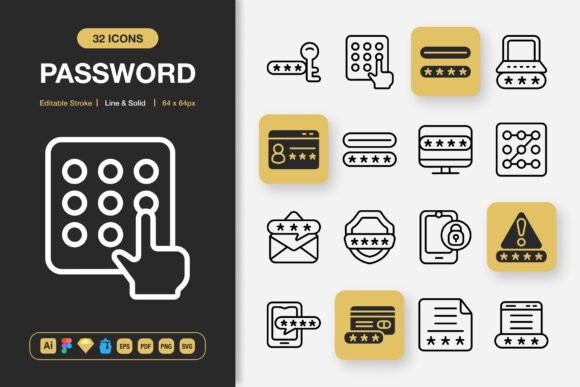
Every digital product that requires user login, account creation, or secure verification relies on a visual shorthand to guide the user. That shorthand often comes in the form of a small but deliberate lock symbol, a key, a shield, or a user silhouette with a checkmark. These are password icons, and while they might seem like minor UI elements, they play an outsized role in usability, trust, and brand consistency. A well-organized set of high-quality password icons can become a subtle backbone of your interface, reducing cognitive friction and reinforcing the security layer without a single line of copy. This article explores how a thoughtfully produced password icon pack fits into real design workflows—from early wireframes to final production assets—and how you can integrate it smoothly across websites, mobile apps, printed materials, and beyond.
The Role of Icon Consistency in User Trust
Users scan security-related interfaces with a heightened sense of caution. A mismatched lock icon—one that looks different on the login page versus the password reset screen—can unconsciously signal sloppiness or even trigger suspicion. Consistency is not just aesthetic; it’s a functional component of trust. When you adopt a cohesive password icons library, you ensure that every instance of a security cue follows the same visual rules. This helps users build a reliable mental model. They know that a particular lock style means “encrypted,” a shield means “protected,” and a key means “access granted.” Over time, that predictability speeds up authentication flows and reduces support queries.
Before you even start a project, consider mapping out the exact password-related states you need to communicate. Common ones include locked/unlocked, show/hide password, biometric verification, two-factor authentication, and account recovery. A versatile set that offers both line and solid styles gives you the flexibility to indicate active states (solid) versus inactive or default states (line), all while maintaining a single stylistic family. This prepares your interface for clear, intuitive interaction long before a user ever types their credentials.
Choosing Between Line and Solid Styles for Password Interfaces
Modern UI design often blends line and solid icons within the same ecosystem. A line-style padlock might sit elegantly in a text input field as a placeholder hint, while a solid version of that same icon could appear as a confirmation badge after a successful password change. The availability of both styles in one password icons pack eliminates the burden of sourcing separate sets and manually matching stroke weights. This kind of deliberate pairing keeps your workflow efficient and your visual language tight.
When you have editable strokes, you gain an extra layer of control. Suppose your brand guidelines demand a 2px stroke for all line icons. With a static icon, you’d be stuck with whatever the original designer chose. But with a customizable icon set that supports editable stroke, you can adjust thickness, join types, and endpoints directly in your design tool. This small capability saves hours of manual vector editing and ensures that every icon aligns with your broader design system, not just the password-specific ones.
Organizing Your Icon Library for Cross-Platform Projects
A disorganized asset folder is a productivity killer. When you’re juggling multiple platforms—say a responsive website, an iOS app, an Android variant, a marketing flyer, and a social media post—you need instant access to the right icon in the right size and format. The password icon set described here is structured with exactly this in mind. Files are provided across multiple formats: Adobe Illustrator source files for deep editing, Figma and Sketch files for drag-and-drop prototyping, an Iconjar file for Mac-based icon management, EPS and PDF for print layouts, and SVG plus PNG sprites for web and development handoff.
Each PNG is exported at key sizes—32px, 48px, 64px, 96px, 128px, 256px, and 512px—so you don’t have to resample or guess resolutions for different use cases. For a mobile app, you might pull the 32px PNG for a status bar icon and the 64px version for a tab bar. For a website hero graphic, the 128px or 256px PNG might be ideal. And when you need infinite scalability, you reach for the SVG. This pre-organized structure fits neatly into a process where you plan assets upfront: you map out every touchpoint, note the required size and format, and then simply grab the matching file from the library without opening a single design tool unnecessarily.
From Source Files to Final Output: File Format Compatibility
One of the biggest friction points in cross-functional teams occurs when designers hand off assets to developers. The developer might need an SVG sprite sheet; the print designer needs a high-resolution PDF; the motion graphics artist wants an editable AI file. A password icon set that includes source files across all these formats acts as a universal adapter. You can drop the Figma file into a collaborative design review, pull the SVG into a React component, and send the EPS to a print shop for a security-themed banner—all from the same purchase. This reduces back-and-forth and prevents the kind of last-minute conversion errors that degrade quality.
During the development phase, easy drag-and-drop functionality in Figma or Sketch means that even non-designers on the team—product managers, content writers, QA testers—can place accurate icons into mockups without degrading the file. That keeps prototyping agile and reduces the designer bottleneck for low-stakes icon placement tasks. Over time, this builds a culture of self-service around the visual asset library, freeing up senior designers to focus on more strategic work.
Implementing Editable Stroke: A Designer’s Flexibility Advantage
Many icon packs look great in previews but fall apart when you try to adapt them to a real brand. The line weights might clash with your typography; the corners might feel too sharp for your rounded aesthetic; the solid shapes might not align with your grid system. A password icons collection that emphasizes editable stroke gives you the freedom to make these adjustments without starting from scratch. In Illustrator, you can open the source file, select multiple paths, and globally change stroke properties. In Figma, you can use vector editing to tweak individual points. This level of control is essential for designers who treat icons as living components of a design system, not just decorative afterthoughts.
Customizing stroke also helps when you need to animate icons. Animated password reveal toggles, loading spinners shaped like locks, or micro-interactions around biometric indicators all require clean vector paths that can be manipulated in tools like After Effects or Lottie. With a fully editable set, you can simplify or break apart paths to prepare them for animation, ensuring smooth keyframes and consistent visual weight. This foresight in asset preparation saves hours of rework later in the motion design stage.
Real-World Workflows: Websites, Mobile Apps, and Beyond
Let’s walk through a typical project lifecycle to see where a specialized password icon library adds tangible value. Imagine you’re designing a fintech app. During the planning phase, you sketch wireframes and note every authentication step: sign-up, login, biometric verification, PIN entry, password change, and security notifications. You pull placeholder icons from the set to visualize these moments without getting bogged down in style decisions. The availability of line and solid options lets you mock up interactive states immediately.
In the design and prototyping stage, you replace placeholders with final stylized icons. Because the pack is drag-and-drop ready in Figma, you integrate the lock icons directly into component libraries, connecting them to interactive variants. You use the editable stroke feature to match the app’s 1.5px default line weight, creating a seamless look. The 100 customizable icons mean you can adapt a base lock into a fingerprint-plus-lock combo, or combine elements to create a unique “password hidden” eye icon that fits your brand’s playful tone.
As the project moves to development, you export SVGs for the web team and PNGs in multiple sizes for app developers. The included Readme.txt clarifies licensing and file structure, so any team member can find what they need. Later, when the marketing department decides to run a security-awareness campaign, they borrow the same icons for social media graphics, infographics, and printed flyers, pulling the high-resolution PNGs and editable AI files. This parallel usage ensures the brand’s security imagery remains unified across every channel, reinforcing recognition.
Quality Control and Long-Term Use in Growing Projects
A set of icons is not a one-time purchase; it’s an investment in your project’s visual longevity. Poorly constructed icons with uneven strokes, misaligned baselines, or missing metadata will cause headaches every time you try to reuse or resize them. High-quality password icons—built with professional attention to pixel alignment, consistent optical sizing, and clean vector architecture—will serve you across many iterations. When you redesign your app in two years, you won’t need to hunt for new security icons; you can update stroke styles, change colors, or shift from line to solid to match the new design language, all within the same editable source files.
Maintaining a central icon repository also becomes easier when the files are well-organized. You can dedicate a folder in your design system to “Authentication Icons,” containing subfolders for line, solid, SVG, PNG, and source files. Team members can bookmark the location, and new hires can onboard quickly by downloading the Iconjar or Figma file. This kind of deliberate organization prevents the duplication of effort and the slow creep of visual inconsistency that afflicts many long-lived products.
Documentation matters too. The included Readme file may contain usage tips or license details, but beyond that, consider creating a simple internal style guide that shows how password icons align with your overall icon set. Note the preferred stroke width, corner radius, and color palette. When you onboard a new designer, they can refer to this guide and immediately produce on-brand work. This small upfront effort multiplies the value of your icon investment over time.
Integrating Icons into Print and Offscreen Media
While digital interfaces are the primary home for password icons, their utility extends into printed materials as well. Think of a security policy booklet for employees, a conference booth banner about data encryption, or an infographic explaining two-factor authentication to non-technical audiences. In these contexts, the high-resolution PNGs at 256px and 512px, the EPS vector file, and the PDF ensure that your icons remain crisp and legible at any printed size. The line style might work better for instructional diagrams, while the solid style can anchor attention-grabbing headers. The cross-media compatibility of the set means you never have to massage a low-resolution web asset into a print document again.
For social media and video, the SVG files and editable AI source allow easy integration into motion templates. You can color the lock icon to match your brand palette, resize it for a YouTube thumbnail, or combine it with typography in a promotional flyer without losing detail. This versatility eliminates the classic “digital-first” asset trap where a web-optimized icon fails spectacularly in a large-format print or high-definition video.
Building a Workflow Around Customizable Icons
To get the most from a password icon library, treat it as a modular system rather than a static resource. Start by identifying all current and future touchpoints that reference security or authentication. Inventory them: login pages, password recovery emails, on-screen help, instructional PDFs, SaaS product tours, even error messages. Then map each touchpoint to the most appropriate icon style and size. Create a simple spreadsheet or design token that links each use case to a specific file path. This proactive mapping removes guesswork from asset selection and slashes the time spent searching through folders later.
Next, leverage the 100 customizable icons not just for passwords but for adjacent concepts. A key icon can become a “generate strong password” button; a shield can signify overall account health; a lock with a checkmark can indicate “session secure.” By repurposing core shapes, you build a coherent visual vocabulary that extends far beyond the initial authentication flow. The editable stroke and source file access let you combine, merge, and subtract shapes to invent new icons without breaking the underlying visual system.
Finally, incorporate the icon set into your team’s regular design critiques. Ask whether the lock icon on the sign-up form feels too heavy or whether the line-style icons on the settings page are easily distinguishable. Because you have both styles and editable vectors, you can make rapid adjustments based on feedback and immediately propagate changes across components. This iterative fine-tuning is what turns a decent interface into a polished, trustworthy one.
Long-Term Value and Adaptability
A premium password icons pack is more than a collection of pretty graphics; it’s a practical tool that supports the entire lifecycle of a project. From the earliest wireframes to the final printed brochure, each file format, size variant, and style option serves a distinct purpose. The ability to edit strokes, drag and drop components, and access source files in Adobe Illustrator, Figma, Sketch, and Iconjar means you’re never locked into a single workflow. As your tools evolve, the source files remain editable, and the SVG and PNG exports remain universally compatible.
In a landscape where user trust is often won or lost by the smallest detail, investing in a robust, thoughtfully structured password icon set pays dividends. It streamlines collaboration between designers, developers, and marketers. It enforces visual cohesion across all platforms. And it gives you the flexibility to adapt to new design trends without rebuilding your asset library from the ground up. By weaving these icons into your process deliberately—mapping them to user flows, documenting their usage, and keeping them organized—you turn a simple design resource into a lasting asset that continuously supports your work.